
Project Overview
The idea of dining out is a treat, something fun to do with friends and family! But to those of us who have dietary restrictions, that is not necessarily the case. Some would say eating out is burdensome, not something they look forward to.
Our client is the CEO of EatUnbound, an existing platform that provides the solution to this very problem. Eat Unbound provides menus from local restaurants to help people with dietary restrictions find suitable dining options. This all sounds great! So where do we come in?
Project Timeline ⏳
2 week sprint
My Role 👩🏻💻
UX Lead
Team 🧑🤝🧑
Project Manager,
Research Lead,
UX Lead, UI Lead
Tools 🛠️
Figma, Zoom, Trello, Miro, Canva
The Problem
While the website is fully operational, there was no functionality to assist restaurant owners and head chefs in managing their listings, updating menu items, checking for accuracy, and accessing analytics on customer usage.
The Solution
Our challenge was to design a restaurant-facing dashboard that would enable restaurant owners and head chefs to manage their listings, update menu items, check for accuracy, and access analytics on customer usage. It had to provide accurate information on local restaurants and their menus but it also had to be user-friendly and visually appealing.
Research
Exploring Local Food Landscape and Dietary Needs
With out timeline in mind, we started our research right away. We wanted to learn more about the existing site as well as possible competitors on the food scene that was local to Arizona, where the client is located. Before we even met with the client, we conducted extensive research on the common challenges faced by people with dietary restrictions. We could see right away that the most common restrictions were gluten-free, vegetarian, and vegan. There were also peanut-free and egg-free options as well.
Interviews
Competitive Analysis
After conducting preliminary research, we scheduled a meeting with our client to get into specific details such as which features he wanted to prioritize and what he envisioned for the overall partnership. During the meeting, the client pointed out the hectic schedules of restaurant owners and stressed the significance of a user-friendly interface for the restaurant-facing aspect of the platform.
And with the details hammered out, we delved into the interview process. The team reached out to our personal networks to find current as well as past restaurant owners and managers. The research lead and I worked on perfecting the interview questions to get the most out of our interviews.
After conducting the interviews, we synthesized the data by affinity mapping. We were able to uncover valuable insights and validate our assumptions about the user experience.
Affinity Map
Takeaways:
Our team had originally thought this would go onto a mobile platform for convenience but were quickly proven wrong as most of the interviewees preferred desktop for more functionality as well as a larger display.
Ease of use was stressed throughout the interviews. It was important that users could use the platform to easily update menus etc.
Design
Ideation, Sketching, and Wireframing out the Journey
Design Studio Workshop
Ideation
With our research and personas in mind, our team decided on a design studio workshop to sketch out our ideas. This allowed us to visualize and explore the potential interface before moving forward with the creation of wireframes.
Site map
I worked on a site map to help with visualizing what the navigation would look like as well as to show what we wanted to include in the interface.
Site Map
User Flows
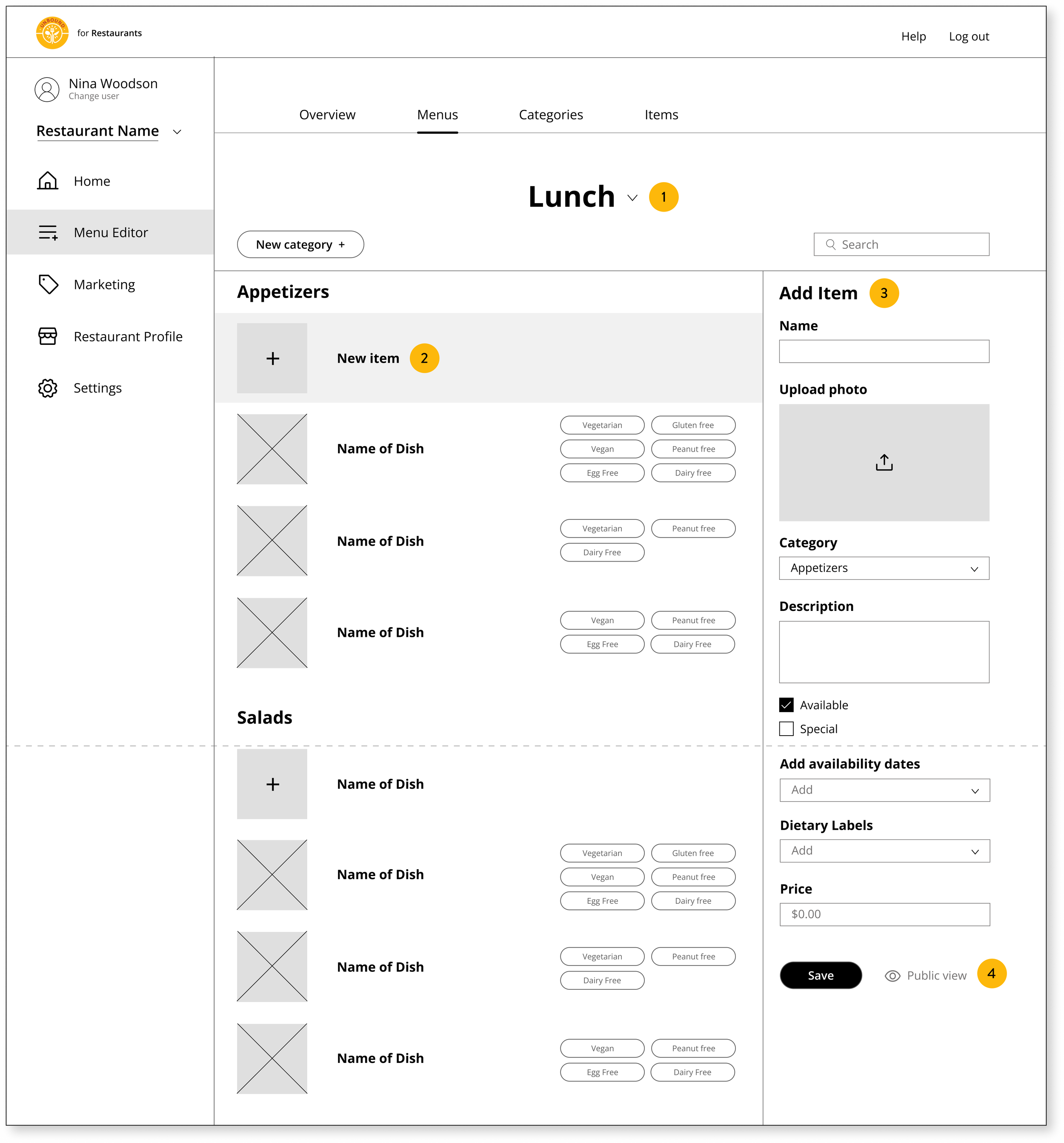
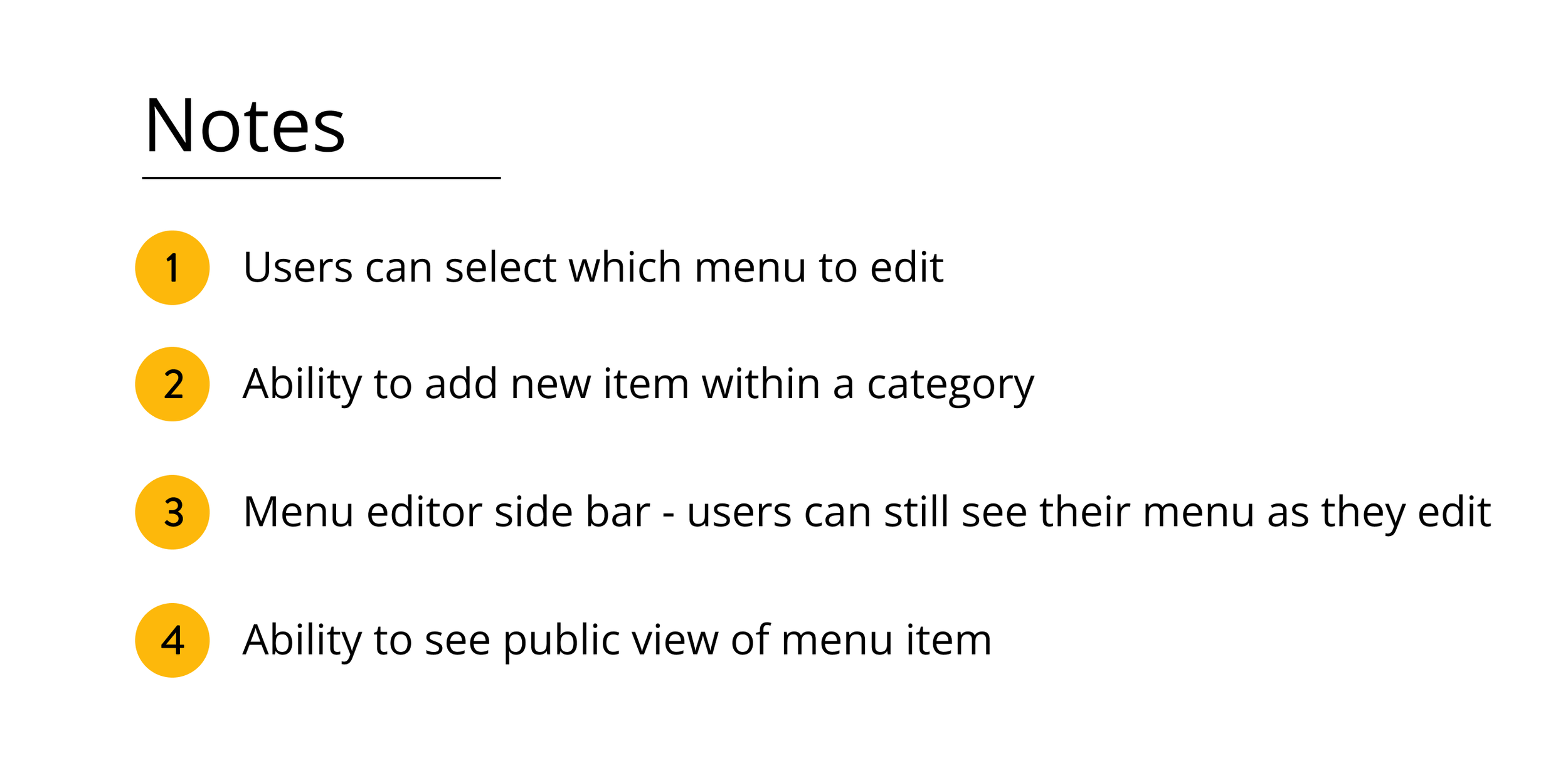
We then moved onto user flows to help visualize the steps an user would walk through to perform a task. This one showed how an user would add a new menu or item within the menu editor.
User Flow 1- Adding Category or Item
In the following user flow, we demonstrate how users can create a menu utilizing the quick upload option or opt for manual entry.
User Flow 2- Uploading/Creating New Menu
Wireframes
And with the basis of the platform built out, our UI Lead dove straight into wireframes.


Prototype
Three Main Tasks
We also had a midway check-in with our client after wireframes were finished. After confirming that we were on the same page, we moved swiftly to prototyping.
We focused on showing three tasks from our dashboard.
1. Editing the current special
2. Adding a new menu item
3. Filtering items by dietary restriction
Usability Testing
Once we had a clickable prototype, we were able to perform usability tests to check if the platform would perform the way we intended. We conducted these tests on the tasks shown above with a former vegan food truck owner, an UX designer, and the third user was a UX designer who used to be a restaurant manager.
We had a 100% success rate for all 3 tasks across all 3 users! We received some helpful feedback during the testing, particularly highlighting its ease of use and user-friendly nature and highlighting our UI Lead’s designs.
Some more feedback on the ease of use as well!
Updates
But with these compliments we also received helpful suggestions detailing what we could work on to improve. One user emphasized that when highlighting the vegan dietary label, it would be helpful for the vegetarian, egg-free, and dairy-free labels to be automatically highlighted as well. This tip was extremely beneficial as it would significantly save time for restaurants who are using these labels.
The vegetarian, egg free, and dairy free labels are now automatically highlighted along with the vegan label.
In our first iteration, when users selected a specific dietary filter to their menu items, the selected dietary labels were highlighted in yellow, while non-applicable labels were outlined in yellow. One of the user pointed out that this approach caused confusion, as it unintentionally emphasized the non-applicable labels in some cases. For instance, in the example provided below, the "Peanut free" label, which is not applicable to the item, stood out prominently, catching users' attention unnecessarily.
The "Peanut free" label, the ONLY label not applicable to the item, stood out prominently, catching users' attention first.
Another user pointed out that the filled in dietary labels were distracting them from the save button because the bright yellow color pulled their eye away. The same user also pointed out that we were using filled in dietary labels in the editing sidebar but not on the main part of the page which suggested they had different functions. We updated all the labels throughout the prototype to be only outlined for a cohesive look.

The same user pointed out that the info icon, which provides information on the definitions of the dietary labels, didn't catch their attention when it had the same color as the text. As a result, they didn't realize they could click on it for more information. Taking their feedback into consideration, we made the necessary adjustment by using a highlighting color to visually separate the info icon from the text. This change ensures that users are more likely to notice and interact with the icon to access additional information.
Lastly, the user pointed out that while most people knew the definition of vegan as well as the common foods that are in the category, there are still other cooking ingredients that people don’t realize aren’t vegan such as honey, gelatin, lard and ghee. We updated the list to provide a more detailed definition for our users.
Final Prototype Demo
Filmed by UI Lead, Payton
Next Steps
Future Implementation Plans
After we completed all the updates based on the usability testing, we presented our work to the client who was very satisfied with how it turned out! If we were to continue our work, we would continue building out the rest of the platform such as Login, Settings, etc. We would also continue with usability testing along the way and updating our prototype accordingly before handing off to development team.
Thanks for reading!